With Elementor Page Builder 3.6, a brand-new element called Elementor Flexbox Container has been released. Flex Container Elementor element lets you use Flexbox CSS properties to build more flexible Elementor websites. In addition, Elementor's Flexbox Container helps you to create outstanding and attractive layouts with just a few clicks and create more responsive and lean designs. Using this feature will also improve your website's performance.
Elementor Flexbox Container will replace sections, columns, and inner sections in Elementor. So, take the chance now to understand and build layouts using them.
We must first outline the benefits of using the Elementor Flexbox Container element and what it offers web designers.
- Create More Optimizing Layouts: You can replace the traditional Elementor sections' columns and inner sections with Elementor Flexbox Container's content direction, item alignment, content justification, etc.
- Reduce DOM bloat: Flexbox container reduces the number of columns and inner-section while creating nested layouts by removing redundant inner div containers and then aligning items using Flexbox CSS. The page code will be reduced as a result of the eliminated divs, which will improve the performance and speed of your page.
- More Responsiveness: Depending on the device viewport, all of those variables will enable you to modify the user experience.
- Unlimited Section Nesting: In the previous version of Elementor, you could only place one inner section within another section. But with the new Elementor Container, you can stack as many Containers as you like inside of each other to build intricate arrangements.
- Now that you can hyperlink the entire container instead of just the widget, you no longer need to instal an additional add-on to do so.
After listing some benefits of Elementor Flexbox Container, let's go on to discussing how to activate this new feature.
How do I activate the Flex Container Element in Elementor?
Then, after installing Elementor in a version higher than 3.6 on your website:
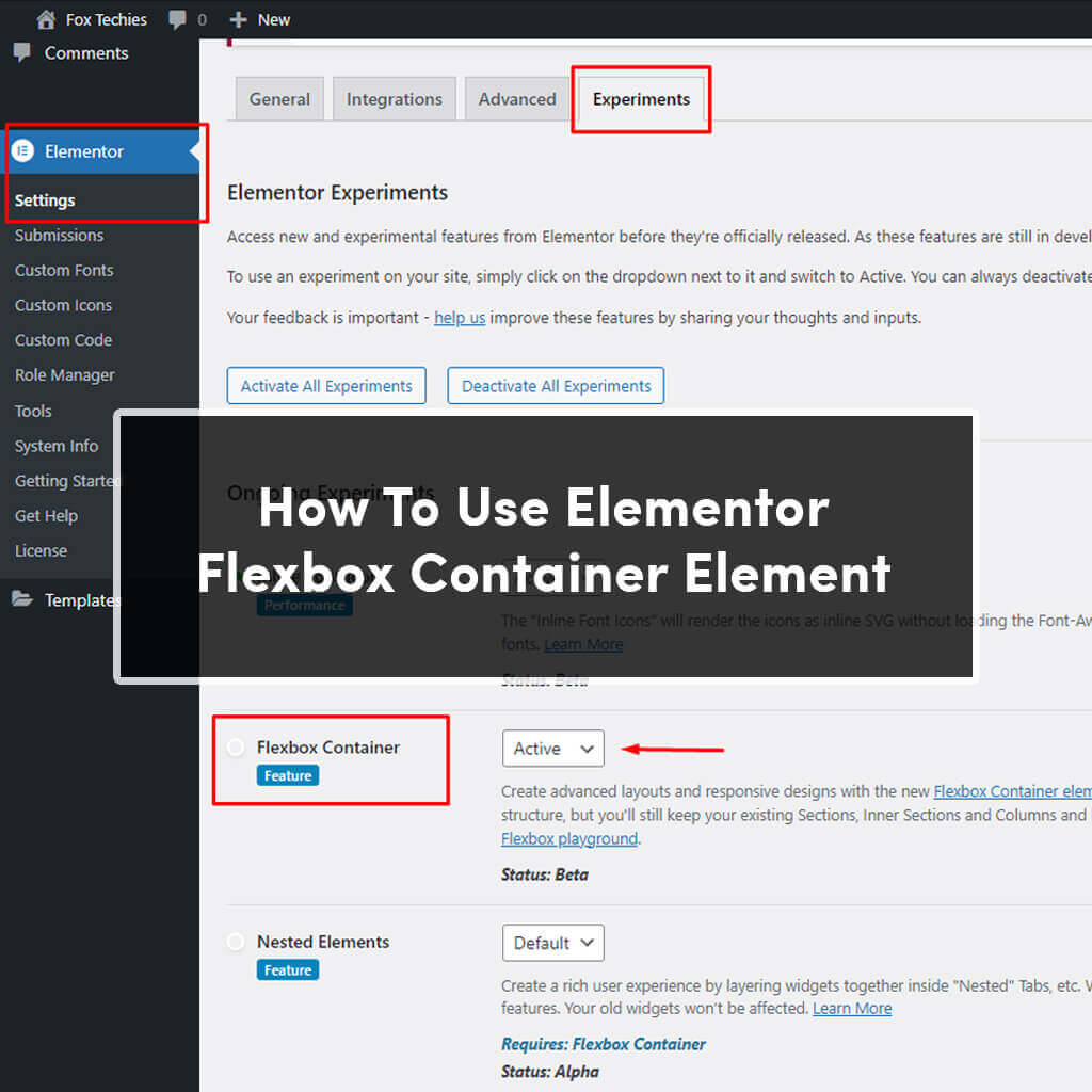
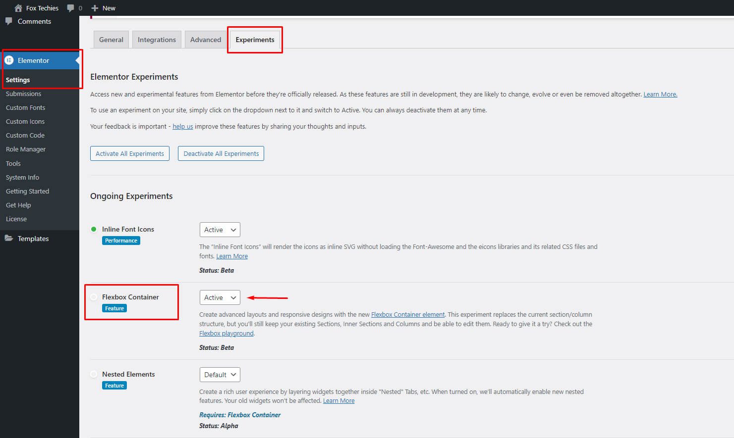
1. Go to Settings in the Elementor section of your WordPress Dashboard.
2. Enter the Elementor Dashboard and select the Experiments tab.
3. Set the Flexbox Container option to Activate when you scroll down.
4. Once you've reached the bottom of the page, click Save Changes.
Options for Elementor Flex Container Elements
With the addition of new choices, Elementor Container Flexbox gives you greater freedom and flexibility when designing and building your layout.
Let’s start with Container options:
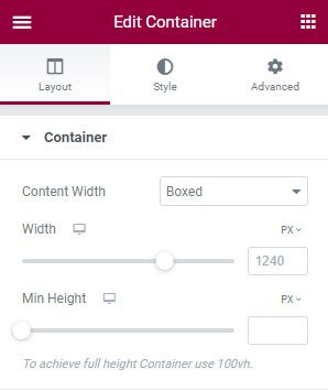
- Choose between boxed and full widths for the container's width.
- With boxed, you can specify the width of your container in various units of measurement and a responsive viewport.
- Full Width: This enables your container to occupy the entire width of the screen.
- Width: Establish the container element's width.
- Min Height: Set the container's minimum height here.
- Overflow: Set the container overflow setting to default, hidden, or auto.
- Default: By default, your element is permitted to be outside the container.
- Hidden: Hiding overloaded components.
- Auto: Expands your container's horizontal scroll bar.
- HTML Tag: From the menu, choose the container HTML tag. Using a tag, you can make the entire container clickable.

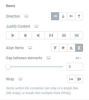
Additionally, it adds additional group options called Items that are used with container elements:
- Set the Row, Column, Reversed Row, or Reversed Column direction for container components.
- Row: Arrange things in a row.
- Place items vertically in columns.
- Elements are arranged horizontally in reverse order in a reverse row.
- Reversed Column: Arrange things vertically in the opposite direction.
- Adjust Items: Align the container's elements to the stretch, centre, start, or end of the flex.
- Flex Start: Align items at the beginning of the container in either the Row or Column directions.
- Algin elements should be placed in the Elementor container's centre.
- Algin elements to container's end using flex end.
- Stretch: Extend your components to fill the space available.
- Justify Content: Specifies the distance between and around content items along a flex container's main axis and a grid's inline axis.
- Flex Start: Align elements to the container's start edge.
- Center: Align components in the container's centre.
- Flex End: Justify elements so that they are aligned with the main-end side of the container.
- Space Between: Each pair of items has a fixed distance between them.
- Space Around: Set a consistent distance between each pair of items.
- Elements Gap: Set gaps between Elementor elements using the Elements Gap setting.
- Wrap: Set an element's wrap so that it spans one or more lines.

Start experimenting and testing the Elementor Flexbox Containers features now to see if you can quickly and easily produce innovative layouts.


